How To Style The Perfect Home Office
Creating a comfortable home office takes more than just placing a desk and chair into the corner of a room. Once regarded as a luxury, built-in study .


Buying a new home is one of the biggest decisions most people make in a lifetime. The choice to make an offer or bid at auction on a particular property is driven by an emotional decision, rather than one rooted in logic. Is this a home that you can see your family thriving in? Is this a home where you would feel peaceful and calm? Is this a home where you would entertain friends and family?
Colour psychology is sometimes written off as just “hocus-pocus”, however, there is proven science behind how certain colours spark strong emotional reactions in people. This feeling can be a subconscious or a visceral reaction to certain colour palettes, that either positively or negatively affects their mood.
These feelings can be the one key difference between a potential buyer deciding your property is their new family home, or deciding that they won’t put in an offer.
.jpg?width=768&name=9a60d67e-29bb-49b3-94dd-f9d8745ac57d%20(2).jpg)
Scientifically speaking, colour is the first thing that our brains register and react to when viewing something new. Our limbic system is the part of the brain that is in control of emotional and behavioural responses, you may have also heard it referred to as the “flight or fight response”. When colour is transmitted from your eyes to your brain, there is a release of a hormone that affects your emotional response, which in turn affects your mood.
Scientists have been studying the brains response to different colours since as far back as 1875. In more recent times, these studies have been adapted to a new field called “colour psychology” which is used across many fields; from product design, marketing and advertising, interior design and even medicine!
It is important to note that men and women react differently to colours - as do members of different cultures, different ages and backgrounds. However, in general, certain colours are used universally by designers, architects and governments to influence how people interact in public spaces.
The ultimate goal of a sales campaign is to market the property to the right demographic of potential buyers, encouraging them to picture the “aspirational lifestyle” they would have if they were successful in purchasing this home. Sales agents also want to ensure there are multiple potential buyers, as increasing demand increases the auction price and the success of the sales campaign.
Enter property styling. A professional property stylist will research and consider the ideal audience for your home and then tailor their styling accordingly. This styling includes everything from the furniture and artworks chosen to emulate the “aspirational lifestyle”, to the placement of these items to best highlight the natural features of the home - and downplay the less desirable features!
Colour psychology comes into play here, with stylists strategically choosing tones and colour palettes that will communicate the ideal message to the potential buyers - both in person at an inspection, but also (and arguably more importantly of late) colours that present well online in the professional photography and even virtual tours.
Part of this involves ensuring that they choose a cohesive and welcoming colour scheme, ensuring that there is no overpowering colours used that would trigger a negative response. Often this means neutral shades to provide an inoffensive base that will appeal to a wide range of potential buyers. By using a majority of neutral colours, the focus moves from the styling to highlighting the key features and built-in focal points of the home itself.
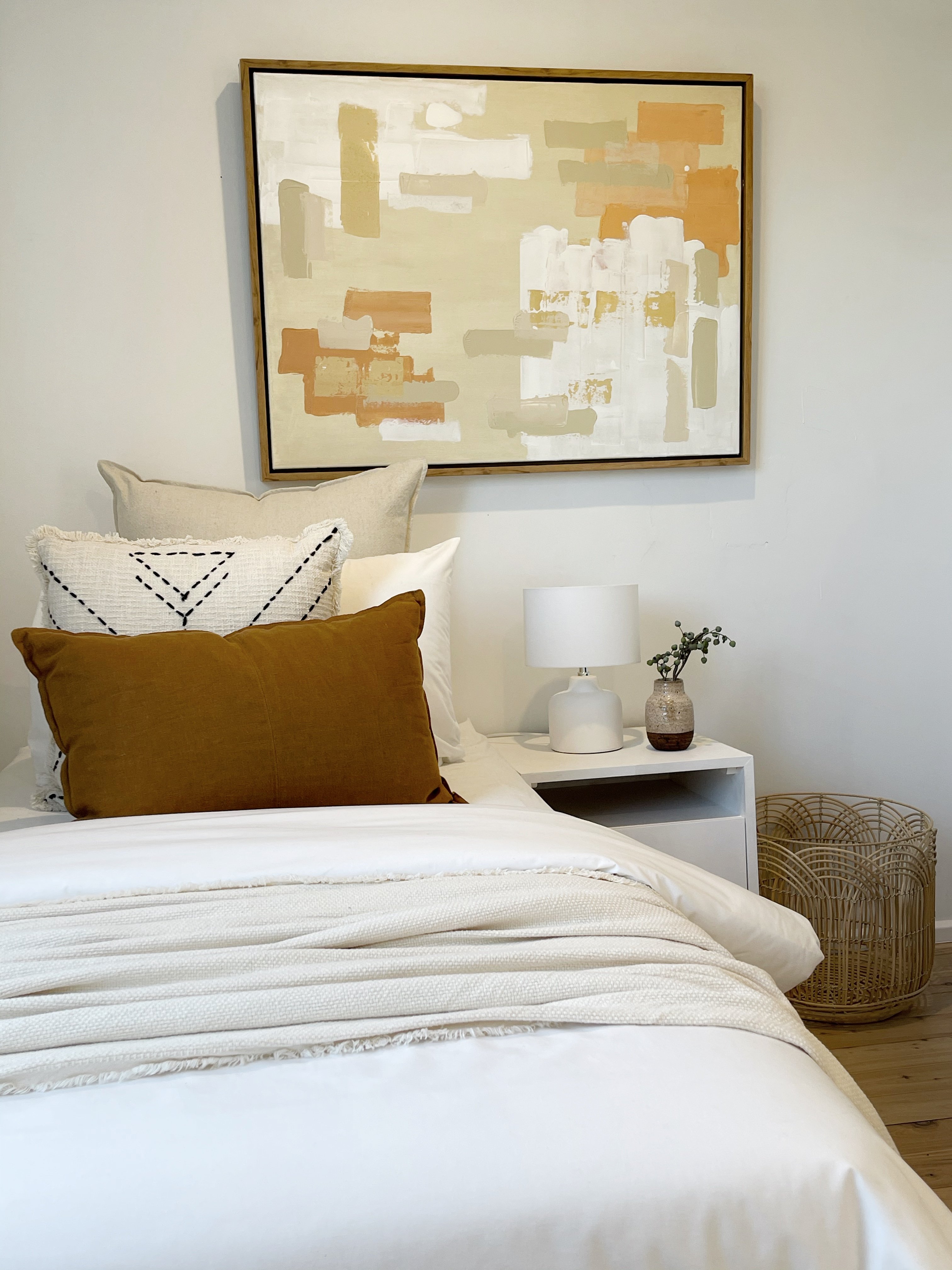
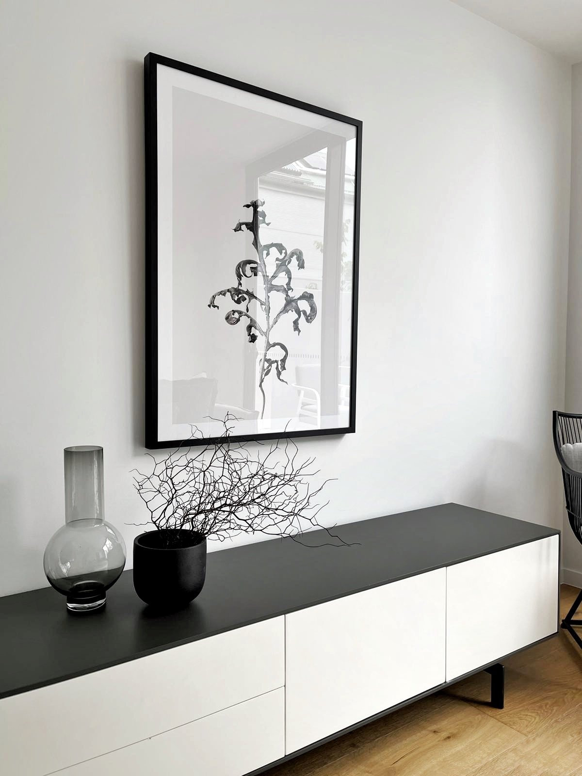
White is a classic neutral colour, communicating cleanliness, good quality and a contemporary look. White makes smaller rooms appear larger and gives the space perception of height and grandness.
Although there are over 150,000 different shades of white, a whole house styled with white would fall flat. Expert property stylists know that it is essential to tie in other colours to make the property more approachable and to have a positive and lasting impression on potential buyers.
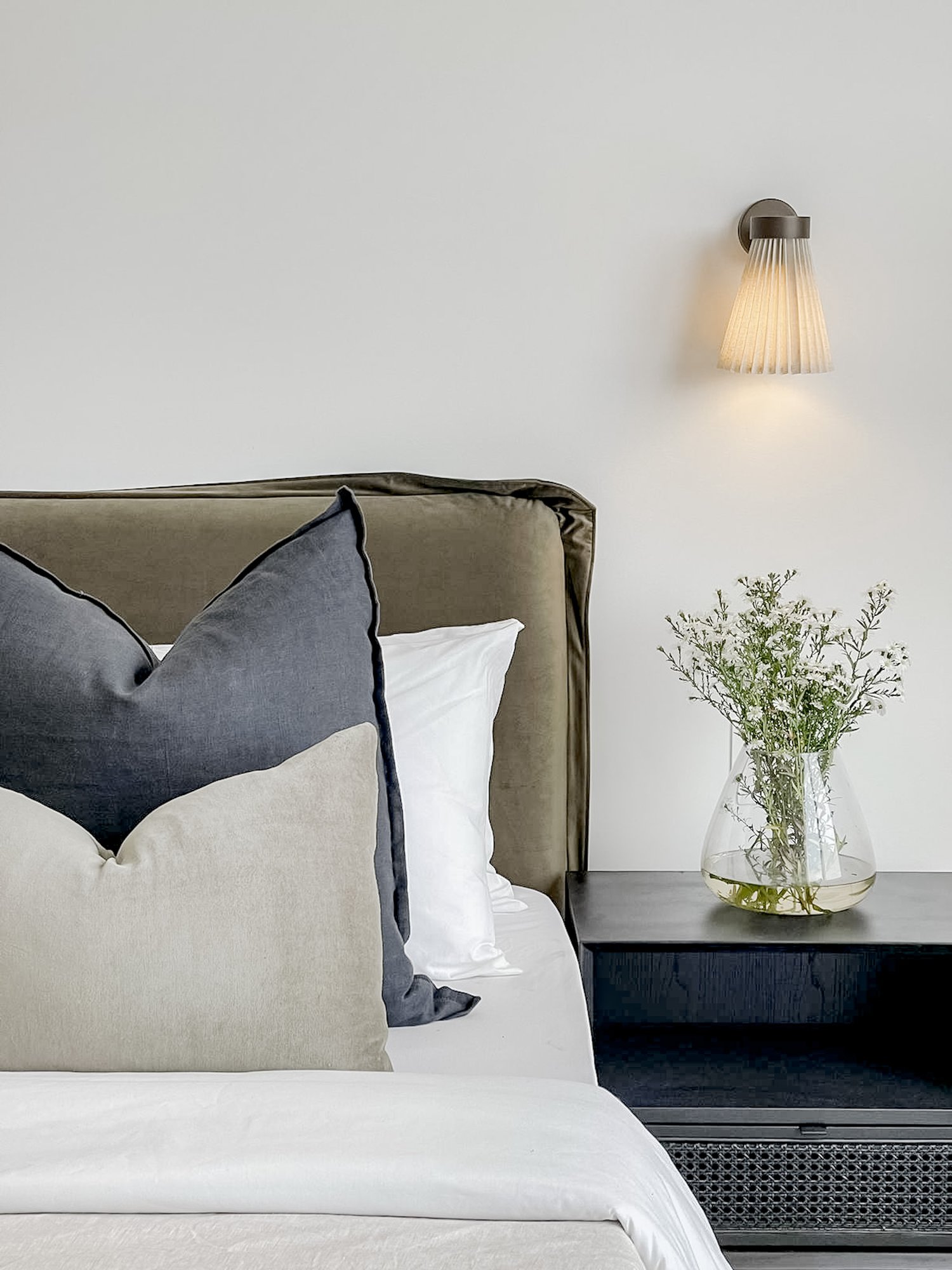
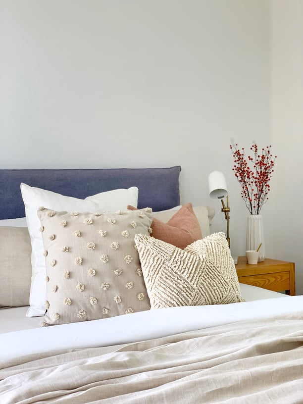
Cooler colours such as blues, greens and greys are naturally calming, and they bring a relaxed and refreshed vibe to a property when used correctly. They are best used in rooms where the aim is to have a sense of unwinding or tranquillity - such as bathrooms, and even bedrooms.
Stylists avoid the overuse of cool tones, however, as they can make a space less inviting and seem cold or sterile.
Reds, pinks, browns and yellows are considered warm tones, and they communicate an energetic and stimulating tone to a room. They are ideally used in more communal spaces, where the aim is to spark a sense of fun and foster conversation - think kitchens, dining rooms and living rooms where there is lots of activity.
Overdoing the warm colours however does have negative impacts, as they can feel overpowering and busy in many environments, and feel cloying to some viewers.
Black is a grounding colour when used in small doses, and it represents sophistication, luxury and opulence - especially when paired with white and other neutral colours.
However, whole furniture pieces in black are overpowering to most spaces, so expert stylists bring in black with accessories, minimalist line artworks, and other pieces.
Here at Spatial Property Styling, we assess each and every home we style on an individual basis. It’s important to us to view the home in person if possible, as the natural lighting and being in the space allows us to take note of the exact undertones in the paint colours, carpet, floorboards and other finishings that provide the natural canvas for the property styling.
We take lots of photos on a site visit, as this will help our stylists envisage and plan how the colour scheme will translate to a digital view. Now more than ever, potential buyers are viewing listings online before deciding whether to continue with an in-person inspection, so it’s vital that the colour scheme also conveys the right messaging online.
Additionally, particular attention is paid to the ideal demographic of potential buyers in the area. Different suburbs in Sydney have different personalities, from the classic contemporary Hamptons style in the Northern beaches to the quirky bohemian vibes of the Inner West and the laid-back luxurious leafy suburbs in the Northern suburbs. Your stylist should take into consideration colour psychology when deciding upon the colour palette for your property in line with these different demographics to evoke a harmonious and relaxed feeling in the viewer. After all, the aim is for the potential buyers to feel at home from the first moment they step through the door front.

Colour psychology is an integral part of your professional property stylists arsenal when it comes to styling your home for the best possible sales outcome. The strong connection between human emotions and certain colours means that the colour palette used in styling makes a huge impact on the mindset of potential buyers. The aim is when they view your property, either in person or online, that the emotional response is powerful enough to motivate potential buyers to put in an offer or bid at auction.

Creating a comfortable home office takes more than just placing a desk and chair into the corner of a room. Once regarded as a luxury, built-in study .
Today, most properties for sale in the Sydney metro area are styled to some degree. Whether it’s a declutter, furniture reshuffle or complete .
Interior planning with indoor plants Interior design is the art and science of complementing the features of a space. Every small detail is important .


.png?width=196&height=198&name=DSC02972%206%20(9).png)
.png?width=196&height=198&name=DSC02972%206%20(10).png)
.png?width=196&height=198&name=DSC02972%206%20(11).png)
.png?width=196&height=198&name=DSC02972%206%20(12).png)
.png?width=196&height=198&name=DSC02972%206%20(13).png)